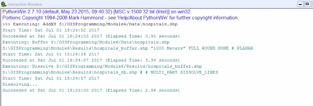
Python scripting can be a powerful tool to automate geoprocessing with GIS, but there are a few steps you need to follow. As shown in the flowchart below, by undertaking the outlined steps, you can successfully run geoprocesses and produce results like those show in the window above. In this exercise we used the AddXY, Buffer, and Dissolve tools.
Michael Stavely UWF - GIS
Saturday, July 1, 2017
Wednesday, June 28, 2017
Geoprocessing with ArcGIS
In order to produce the map above of the arable land in the basin, we analyzed the basin study area and the soils. We clipped the larger soils file to the basin shape, selected the land that is unusable to farmers determined by soil type, and erased this selection from the basin shape. The final output is the area of the basin that is useful for agriculture.
Wednesday, June 14, 2017
Using Modules in Python
For this script we used the random module and gained experience calling modules in Python. We called random integers to simulate a dice game. Also we created lists and used the append function in order to create a random number list between 0 and 10. Finally we used the For and While loops in addition to the remove function in order to remove all instances of a certain value from the list.
Sunday, June 4, 2017
Suitability Analysis
In Suitability Analysis we can compare a variety of variable in order to determine the most suitable geospatial location. In this situation, we compared elevation, land cover, soil type, distance from roads and distance from rivers. In the Equal Weight scenario we used the weighted overlay tool to compare the 5 pre-processed variables and assigned 20% weight to all. While this may make sense comparing just the raster, this is not effective in real scenarios. For the alternative, we used real world data and project specifics to weight the variables based on importance to the client. In this situation we assigned land cover and soils a value of 20% each, slope 40%, and distance to streams and roads at 10% each.
Wednesday, May 31, 2017
Introduction to Python
This screen shows the result of the steps of the flowchart. The split method divides the string based on the spaces and this value can be replaced by commas, slashes, any character. In the list created any position can be called but since we are interested in the last we will use place holder -1. Finally you will count the letters in this string entry and multiply this by 3 and print the results.
Saturday, April 8, 2017
Temporal Mapping
The use of ArcGIS time feature can allow for analysis throughout time to promote extra visualization. The following maps are a good example of this. They visualize the volcanoes of recorded history and show their magnitude. As this is an accumulation the later maps have more features, but the time series indicates that the number grows exponentially. This is due to the addition of smaller eruptions as early volcanoes may not have been recorded if they eruptions occurred in areas without written language and the eruptions did not have a wide spatial impact. This is an assumption that would be difficult to make without the time visualization tool.
In order to prepare this map I used the ArcMap time features to turn on the temporal settings in the eruptions layer. Next I built a frequency table through use of the Frequency tool in the Statistics toolset. From here I built a sequence count and connected the table to the Eruption layer and adjusted the time properties accordingly. From here I was able to create a video to display the map.
Early in the Time Series
Middle of the Time Series
Final step of the Time Series
Thursday, March 30, 2017
Bivariate Maps
Bivariate maps are the geographical equivalent of Boolean math. Through the comparison of two related variables we can visualized the regions where both conditions are true (AND) as well as where one is true and the other is false (OR). To make a bivariate choropleth map, you should overlay the two variables. This can be done by selecting the number of classes for each choropleth (usually 2 or 3) and applying a quantile classification. Then you assign each variable with a scaled value (1,2,3... A,B,C...) and combine to produce a new field withe 4 or 9 types. When you symbolize based on these types with a predetermined color scheme, the end result should give the appearance of overlaying the two maps.
Subscribe to:
Comments (Atom)


