
Wednesday, February 22, 2017
Choropleth
Thursday, February 16, 2017
Proportional Symbology
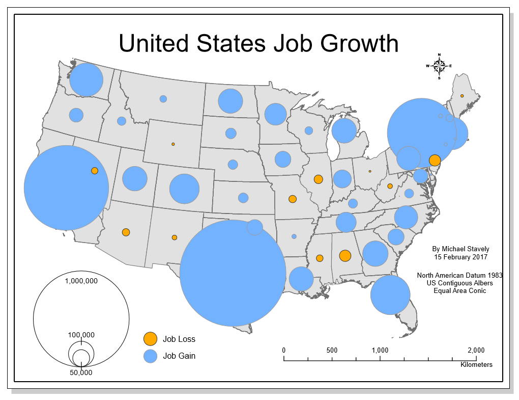
The goal of any map is to communicate more clearly geospatial data. One of the best ways to accomplish this through symbology is through the use of proportional symbol mapping. The figure above depicts job growth both positive and negative through the size of the points representing each state. While the size of the points communicates magnitude well, the negative values must be represented through color, since there cannot be negative symbology. As indicated by the legend, the orange points represent job loss, which in this map is a negative value, and the blue represents job growth. This follows the natural pattern of cool colors representing good emotions and warm colors representing severity. All of this combines to make this map more easily understood.
Wednesday, February 8, 2017
Color
Color Ramp #1 Linear Progression

Color Ramp #2 Adjusted Progression

Color Ramp #3 ColorBrew

While the three different color palettes all begin and end
similarly, the steps between the categories varies with each method to create
unique values. In the linear progression equally progresses through the steps
and shows the six steps. In the adjusted progression, the first step from the
darkest color is about 1/3 higher than the average step to distinguish the
darker colors, but the lowest step is 1/3 lower than the average because the
light colors are more easily distinguished.
In the ColorBrewer application, the sequential palette that most closely
relates to the other palettes is the multi-hue from dark green to a pale blue. While
this palette contains slightly more blue through the progression, the added hue
easily distinguishes the categories. The interval is not set at a constant rate
or based on math equation, but visible differences and approaching a bluer
tint. This closely resembles the second scale, but is more clear with the final
value almost white and the previous colors clearly distinguished from the step
above.
Wednesday, February 1, 2017
Typography

Subscribe to:
Posts (Atom)