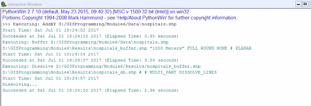
Python scripting can be a powerful tool to automate geoprocessing with GIS, but there are a few steps you need to follow. As shown in the flowchart below, by undertaking the outlined steps, you can successfully run geoprocesses and produce results like those show in the window above. In this exercise we used the AddXY, Buffer, and Dissolve tools.
Saturday, July 1, 2017
Wednesday, June 28, 2017
Geoprocessing with ArcGIS
In order to produce the map above of the arable land in the basin, we analyzed the basin study area and the soils. We clipped the larger soils file to the basin shape, selected the land that is unusable to farmers determined by soil type, and erased this selection from the basin shape. The final output is the area of the basin that is useful for agriculture.
Wednesday, June 14, 2017
Using Modules in Python
For this script we used the random module and gained experience calling modules in Python. We called random integers to simulate a dice game. Also we created lists and used the append function in order to create a random number list between 0 and 10. Finally we used the For and While loops in addition to the remove function in order to remove all instances of a certain value from the list.
Sunday, June 4, 2017
Suitability Analysis
In Suitability Analysis we can compare a variety of variable in order to determine the most suitable geospatial location. In this situation, we compared elevation, land cover, soil type, distance from roads and distance from rivers. In the Equal Weight scenario we used the weighted overlay tool to compare the 5 pre-processed variables and assigned 20% weight to all. While this may make sense comparing just the raster, this is not effective in real scenarios. For the alternative, we used real world data and project specifics to weight the variables based on importance to the client. In this situation we assigned land cover and soils a value of 20% each, slope 40%, and distance to streams and roads at 10% each.
Wednesday, May 31, 2017
Introduction to Python
This screen shows the result of the steps of the flowchart. The split method divides the string based on the spaces and this value can be replaced by commas, slashes, any character. In the list created any position can be called but since we are interested in the last we will use place holder -1. Finally you will count the letters in this string entry and multiply this by 3 and print the results.
Saturday, April 8, 2017
Temporal Mapping
The use of ArcGIS time feature can allow for analysis throughout time to promote extra visualization. The following maps are a good example of this. They visualize the volcanoes of recorded history and show their magnitude. As this is an accumulation the later maps have more features, but the time series indicates that the number grows exponentially. This is due to the addition of smaller eruptions as early volcanoes may not have been recorded if they eruptions occurred in areas without written language and the eruptions did not have a wide spatial impact. This is an assumption that would be difficult to make without the time visualization tool.
In order to prepare this map I used the ArcMap time features to turn on the temporal settings in the eruptions layer. Next I built a frequency table through use of the Frequency tool in the Statistics toolset. From here I built a sequence count and connected the table to the Eruption layer and adjusted the time properties accordingly. From here I was able to create a video to display the map.
Early in the Time Series
Middle of the Time Series
Final step of the Time Series
Thursday, March 30, 2017
Bivariate Maps
Bivariate maps are the geographical equivalent of Boolean math. Through the comparison of two related variables we can visualized the regions where both conditions are true (AND) as well as where one is true and the other is false (OR). To make a bivariate choropleth map, you should overlay the two variables. This can be done by selecting the number of classes for each choropleth (usually 2 or 3) and applying a quantile classification. Then you assign each variable with a scaled value (1,2,3... A,B,C...) and combine to produce a new field withe 4 or 9 types. When you symbolize based on these types with a predetermined color scheme, the end result should give the appearance of overlaying the two maps.
Wednesday, March 22, 2017
Infographic
To
finalize the layout I added text and color in order to promoted an
understanding of the data charts in relation to the maps and support visual
contrast. I also tried to frame the neatline with the extra information to
improve visual balance. I organized the most important charts in the middle
that applied to the data analysis then spread to the edges so it would be clear
which charts were associated with which map.
Thursday, March 9, 2017
Terrain Visualization
In order to highlight the Land Cover of Yellowstone National Park, terrain must be factored into the equation. In order to do this I applied a hillshade effect to a Digital Elevation Model (DEM) in order to give the illusion of three dimensions. I then symbolized the land cover in order to reflect tree species. I used a single hue to symbolize each species, and if multiple variations of their forestry growth cycle were present, I applied different saturation and value in order to create a ladder effect of color. I chose to leave the water blue for familiarity and the unforested areas light grey to symbolize the bedrock and prevent confusion with the forests. I the applied a transparency of 35% to allow the hill shade to shine through the Land Cover. The use of bold draws the attention to the title even though it is not placed in a traditional spot in order to promote a larger map and overall balance.
Wednesday, February 22, 2017
Choropleth
In order to visually represent the change in population across the counties of Colorado from 2010 to 2014, I chose a diverging color scheme to highlight the growth and loss in population. Because we associate green with growth, I applied a green color ramp to the classification denoting growth with the highest growth having the strongest green. Similarly I applies a red color scheme to highlight the loss of population in negative growth.
Thursday, February 16, 2017
Proportional Symbology
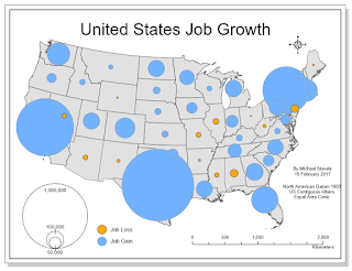
The goal of any map is to communicate more clearly geospatial data. One of the best ways to accomplish this through symbology is through the use of proportional symbol mapping. The figure above depicts job growth both positive and negative through the size of the points representing each state. While the size of the points communicates magnitude well, the negative values must be represented through color, since there cannot be negative symbology. As indicated by the legend, the orange points represent job loss, which in this map is a negative value, and the blue represents job growth. This follows the natural pattern of cool colors representing good emotions and warm colors representing severity. All of this combines to make this map more easily understood.
Wednesday, February 8, 2017
Color
Color Ramp #1 Linear Progression
Color Ramp #2 Adjusted Progression
Color Ramp #3 ColorBrew
While the three different color palettes all begin and end
similarly, the steps between the categories varies with each method to create
unique values. In the linear progression equally progresses through the steps
and shows the six steps. In the adjusted progression, the first step from the
darkest color is about 1/3 higher than the average step to distinguish the
darker colors, but the lowest step is 1/3 lower than the average because the
light colors are more easily distinguished.
In the ColorBrewer application, the sequential palette that most closely
relates to the other palettes is the multi-hue from dark green to a pale blue. While
this palette contains slightly more blue through the progression, the added hue
easily distinguishes the categories. The interval is not set at a constant rate
or based on math equation, but visible differences and approaching a bluer
tint. This closely resembles the second scale, but is more clear with the final
value almost white and the previous colors clearly distinguished from the step
above.
Wednesday, February 1, 2017
Typography
In order to effectively describe the greater San Francisco area, multiple font sizes and styles were required to distinguish features on a flat map. The most prominent label is San Francisco in order to connect that regardless of the other features; they all are part of the city. Other notable labels include the golden gate bridge which connect directly to the landmark and the water bodies.
Wednesday, January 25, 2017
Coordinate Systems
I chose the NAD_1983_StatePlane_Tennessee_FIPS_4100 because the entire state of Tennessee fits in the State Plane projection. When choosing between this and the UTM and the State Plane, there's no choice since the UTM divides the state into 3 parts. Since its predominantly E-W, a conic projection could work, but the state plane is simple and accurate.
Wednesday, January 18, 2017
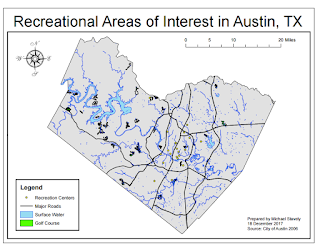
The 5 Principles of Geospatial Design
The 5 design principles of Mapping are Visual
Contrast, Legibility, Figure-Ground
Organization, Hierarchical
organization, and Balance.
I chose the different symbols such as the green golf courses, and yellow area's of interest (AOIs) in
order to create visual contrast between the colored items and the county map.
The title, layout, and simplicity contribute to the legibility and communication of data. Simply removing
the background counties and roads allowed for good figure-ground orientation
and focus the map. The centering and size of the map as well as the balanced
four corners of layout elements draw attention to the data and establish
hierarchical organization.
Subscribe to:
Posts (Atom)


