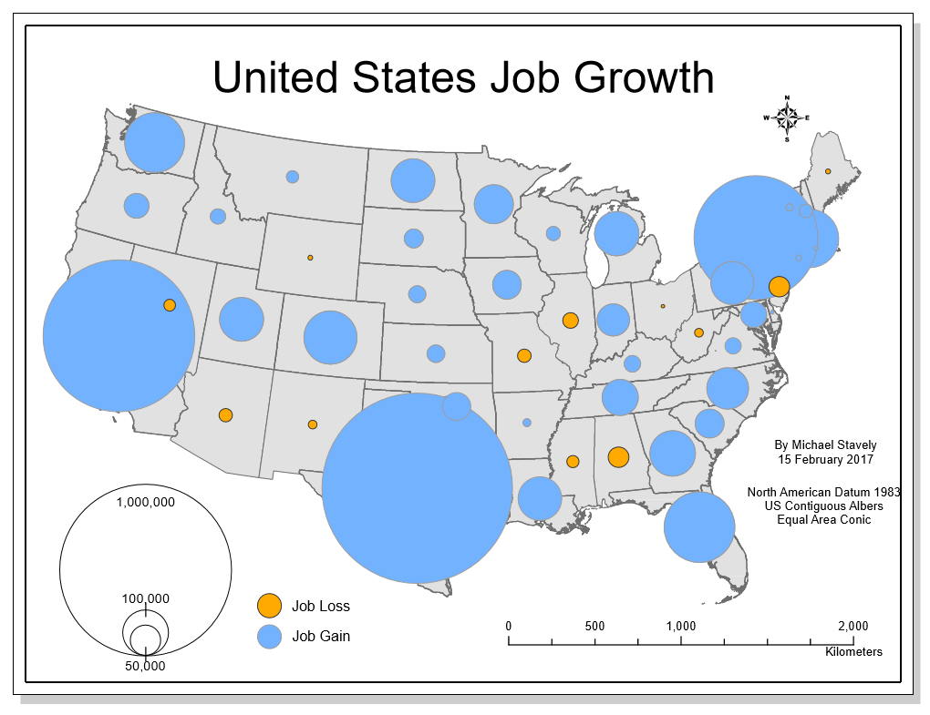
The goal of any map is to communicate more clearly geospatial data. One of the best ways to accomplish this through symbology is through the use of proportional symbol mapping. The figure above depicts job growth both positive and negative through the size of the points representing each state. While the size of the points communicates magnitude well, the negative values must be represented through color, since there cannot be negative symbology. As indicated by the legend, the orange points represent job loss, which in this map is a negative value, and the blue represents job growth. This follows the natural pattern of cool colors representing good emotions and warm colors representing severity. All of this combines to make this map more easily understood.
No comments:
Post a Comment